Flat web design - what is it and do I need it?
Web design, just like other aspects of design, will follow trends and in recent times these have included 'Flat' design which presents a minimalistic approach with geometric panels, solid colours, clear sans text and line based 'flat' icons. But where did this come from and why is it beneficial?
How did we get here?
Historically, web design began with a simple approach in terms of graphics, colour and text due to the limitations of bandwidth and 56k dial up modems. The internet was a new landscape, written in code and with unusual constraints - web designers in 1996 only had 20K per page to play with and initially a limited cross platform colour palette. Links were in hyper-text, navigation was rudimentary, fonts were limited. Design was largely dictated by these screen and technology limitations.
As broad band arrived and desktop computers improved, the shackles of this limitation began to be released and richer, image based websites became deliverable, bold headlines could be set like news print and tiles could be deployed to form a large backdrop although these designs still fell short of the major (content) competitor, film and television, which provided a much more immersive screen experience. Technologies were designed to tackle the technical limitations such as Quicktime streaming video in 1998 and 'Flash' which had begun (as Shockwave) for CD-Rom and DVD development. Flash became the Swiss army knife of web content delivery combining interactive elements with animation and video, in fact, whole websites could be built within Flash in order to streamline the delivery of media rich content.
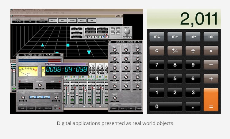
Meanwhile, another driver was pushing screen design on computers and early digital devices, the need to assist users in the transition to the digital world by recreating the real objects they were familiar with on the digital screen - termed skeuomorphism. Apple were at the forefront of this approach introducing a graphics rich layer on their OS called Quartz which later ported to the iOS on iPad and iPhone. As Mac OSX arrived in 2001 this was in stark contrast to the pixelated, flat environment of other operating systems, who never the less, followed the trend.
Inevitably this combination led to a period of excess in web design with developers indulging in visually opulent designs, bespoke interfaces, interactive content and a loss of focus on communication. It seems absurd today that web users would patiently sit watching a 'loader' counting down the launch of a website's home page, but we all did, in order to enjoy the immersive web experience we were promised.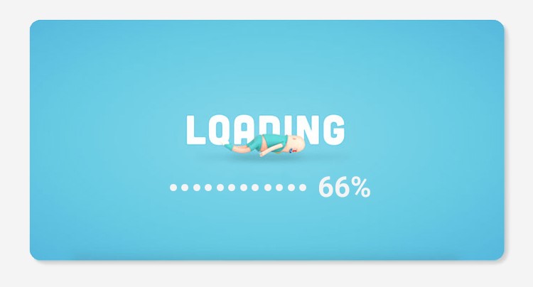
Metro
The significant step forward towards 'flat' design came surprisingly from Microsoft in 2011 with the X-Box user interface and the subsequent wider adoption of this approach as their new design language. In Microsofts words "Metro is our design language. We call it Metro because it's modern and clean. It's fast and in motion. It's about content and typography."
The snappy title, Metro, was unfortunately dropped due to a law suit and simply became the Windows 8 style, however, it was ground breaking and looked ahead to the widespread adoption of mobile platforms which required (once again) small file sizes and clear, simple text and graphics to work effectively on smaller screens and over limited (mobile) bandwidth, almost back to where we began in 1996. This further adaptation to Windows 8, with it's geometric panels, bright flat colours, simple line icons and sans serif text was ideal for mobile and responsive design because it could also adapt to both a vertical (portrait) and horizontal (landscape) screen environment, the panels floating to take up the available space.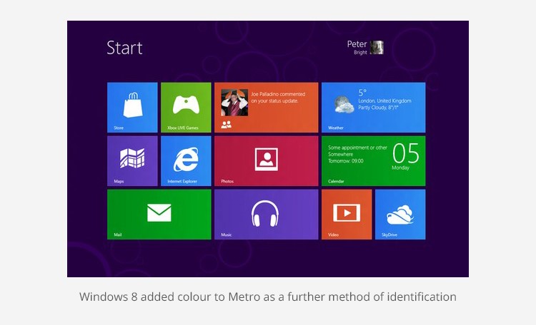
Flat web design adoption
In some respects Metro came too early as it was more suited to touch screen devices and games controllers, not so seamless with a mouse and keyboard. It would be some years before it's influence became more widely adopted as 'Flat' web design, although the seeds were sown and the needs of mobile responsive design would nurture them.
Metro had its roots in the primitive graphic shapes and forms of Constructivism, a Russian movement which began in the 1920s. Its clean lines, flat colours and formal order were developed into a practical and functional style in the German Bauhaus applied to architecture, print design and the typography of Weimer Germany. Later adopted by the Swiss, this went on to form the International Style that influences contemporary design to this day. Ornamental elements and any aspect which served no functional purpose was viewed as unnecessary clutter and a distraction.
This can be seen in the font Futura designed by Paul Renner and released in 1927, described at the time as "the font of today and tomorrow" - simple, clean, geometric, legible at all weights and sizes, it has indeed stood the test of time despite being over shadowed in the 50's following the introduction of Helvetica or Neue Haas Grotesk, a widely used sans-serif typeface developed by Swiss typeface designer Max Miedinger.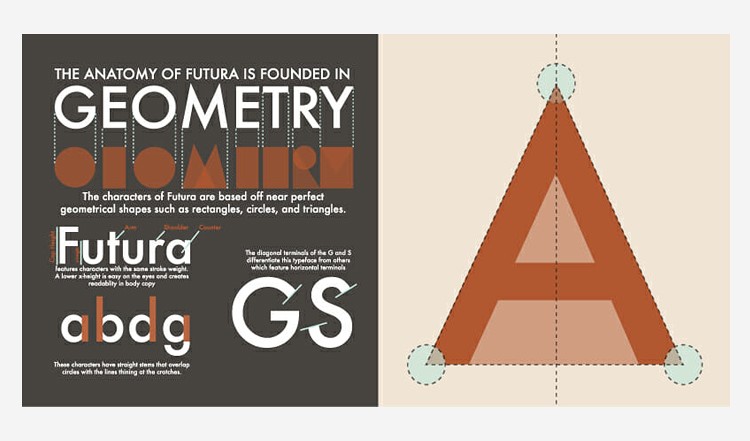
In applying this to web design, the approach is not just to reduce file size and simplify things visually for a narrow bandwidth and small screen, it is really a statement of purpose as it promotes the essence of practical design as a functional tool. A flat website is designed and judged by how well it works, as opposed to what it may look like. Despite the lack of bells and whistles, the approach promotes clear navigation, direct channels for key content and improves access, so it invariably gains a favourable response from users.
The eternal balance - form and function
Design should always be pinned with logical principles which, in the case of web design, include ergonomics (human-centered design that focuses on usability and harmonising the functionality of tasks), clear access to information and accessibility for all. As the British designer Malcolm Garrett once said, "Does it do its job?" A good design will communicate successfully with its audience. Flat web design, if applied thoughtfully, can support this and deliver wider benefits including improved download speed and compatibility across devices and systems. The drawback of flat design, is that the minimalist, functional approach and standardisation can lead to mediocrity against a universal need for organisations to stand out and promote their own brand identity and what they stand for.
A balanced approach can answer both these questions with engaging images, video and animation drawing attention and developing the communication, providing the website remains functional and streamlined in its delivery. The following responsive website designs from Submarine represent this strategy in practice with elements of flat design applied - geometric tiles, sans serif fonts, simple 2D line icons, flat colour and short, direct messaging. A sense of character and engagement are retained.
Example links
www.submarine.gg - this website, our own, opens with a full screen animation, a unique identity and an invitation to engage from the first statement. Internally the pages feature geometric link panels with short titles, line icons, sans serif fonts a flat colour scheme. Simple animation re-enforces navigation where appropriate. A flat web design with character. IMAGE (click to view).
www.seachangerecruitment.com - the website opens with an engaging full screen image and an inspirational headline. Hover over the navigation and scroll down the page to reveal the flat design elements that make this website easy to navigate on desktop or mobile device. IMAGE (click to view).
www.kings.gg - this website opens with full screen video to present the premium offer in an immersive manner. Scroll down the page to be presented with a Metro like matrix of panels which allow the user to directly access key information within the website. The highest levels of technical optimisation, ensure that this experience can be delivered whilst still maintaining a short delivery time. IMAGE (click to view).
Guernsey Foster Care - this website in development extols the virtues of both character and functional flat design in its modular approach apparent from the home page. IMAGE (click to view).
States of Alderney - this website in development, follows a flat design approach and in this case, the clean lines and minimalist approach re-enforces both the authority of the office and the economic approach to cost of build, paid for as it is through public funding. IMAGE (click to view).


Have you landed here from a web search?
Submarine are a technical and creative solutions provider based on the island of Guernsey near the French coast. Our field of operation is generally the Channel Islands although we do service clients with wider operations within Europe.