Interben - new finance brand
When international finance provider Nordben required a new brand entity to extend their portfolio through the Channel Islands, Submarine senior creative Paul Brown was engaged to guide the process and develop the new identity.
Establishing a new brand for a business is a multi-dimensional task which extends to the heart of the organisation, the unique experience and products it provides. As Mark Thompson, CEO of The New York Times and former Director General of the BBC once remarked: "The brand unites us all in a common purpose within the organisation and connects us with the people we serve on the outside. Brands give meaning to who we are and what we do as a business."
Every brand must have a strong foundation, and this begins with the brand mark and it's logotype. The mark at its best can become as widely recognised as the company name - consider the Adidas three angular stripes. Combined with the title in a logo it must be recognisable, distinctive and memorable, setting the organisation apart.
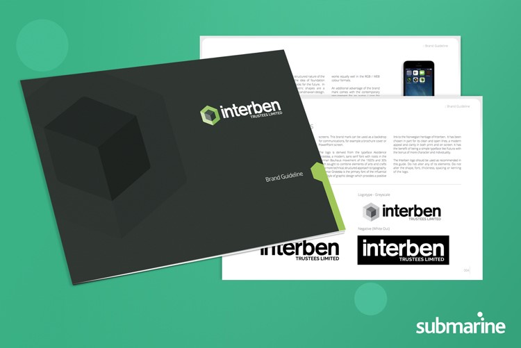
The logo is developed into applications suitable for all the communications that the organisation may engage through including print and screen. It is also essential that the logotype works effectively through mobile devices, not least since data suggests 50+% of the worlds comm's are made through online channels. In order to maintain consistency and control across the organisation and its partners, a brand guideline is provided.
At the outset of the brand development, shape, colour and the type font applied are considered in order to reflect some aspects of the organisation and brand it represents. In the case of Interben, the company was new, however, its roots were in Scandinavia with parent Nordben. The two colours are influenced by the local landscape - lush grasslands, trees and rolling mountains.
The font is both strong and modern, suitable for a forward thinking finance provider wishing to establish confidence and trust in its clients. Geometric shapes are a fundamental of Scandinavian architecture and the regular sided object, a cube, could be said to reflect the structured nature of the product with multiple facets, and the provision of solid building blocks for future financial security.
It isn't critical that every person who views a logo instantly recognises these connections, however, they will develop on a psychological level and through the wider words and communications associated with the organisation and its offer. The important aspect is that the connections inform the design solution towards establishing a unique brand personality.
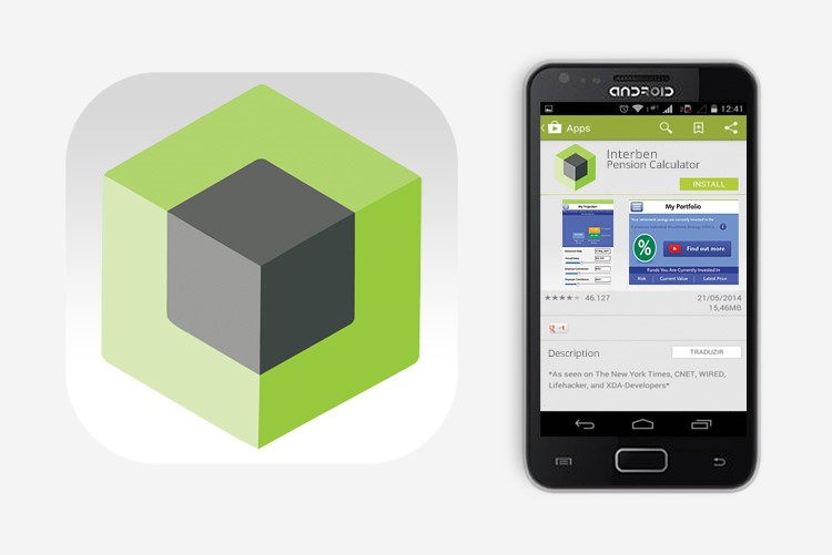
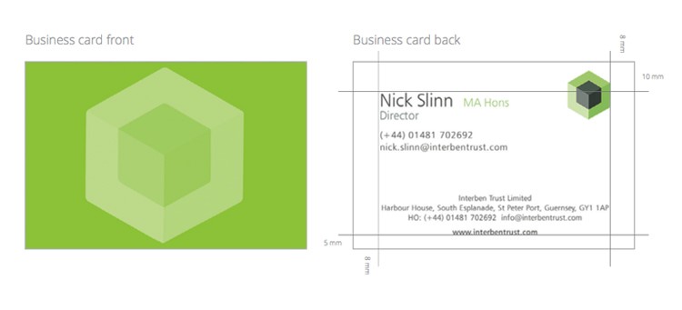
As suggested, mobile deployment of communication are an important consideration at design stage and in the case of Interben this can be seen in the brand mark which was applied to several digital channels including the mobile app icon shown above. There is also an avatar version for social media channels and consideration for an animated version for video deployment. This was also applied to more traditional aspects in an equally memorable manner.
Links
Interben brand guide (draft) - PDF


Have you landed here from a web search?
Submarine are a technical and creative solutions provider based on the island of Guernsey near the French coast. Our field of operation is generally the Channel Islands although we do service clients with wider operations within Europe.